Problem
Simplify inconsistent profile UI across all Dropbox surfaces
Products
Desktop applications (Tray and Desktop App), web, and mobile consulting
My impact
Created a modular, reusable design system component that not only reduced design/engineering complexity but also increased annual reoccurring revenue
For this project I was the lead designer partnering with a mid-level designer working to simplify one of Dropbox’s top user pain points: inconsistent profile UI across all of our surfaces.
With overall company directives prioritizing simplification of our UI, I lead a team to unify the several disparate profile designs seen across our surfaces on desktop and web. Earlier in the year I had also created an internal audit in order to unlock the issues uncovered in key user journeys, and in order to solve deeper underlying issues we had to start from ground zero and re-design the user’s profile. Once this new UI was in place, we could then address more complex issues.
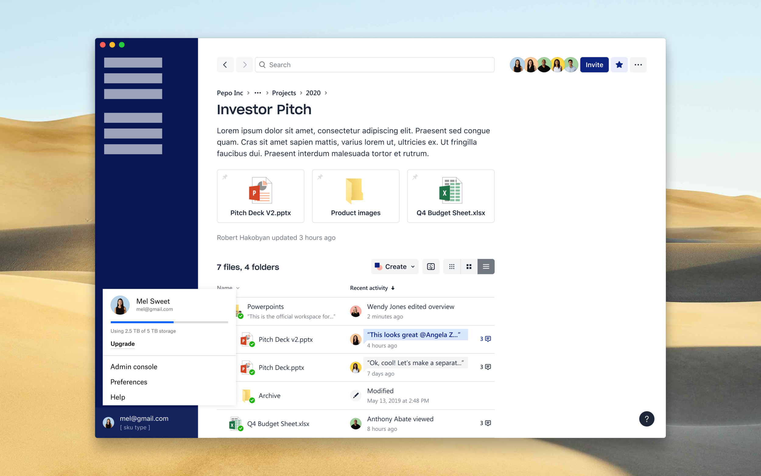
Final design for the Desktop app
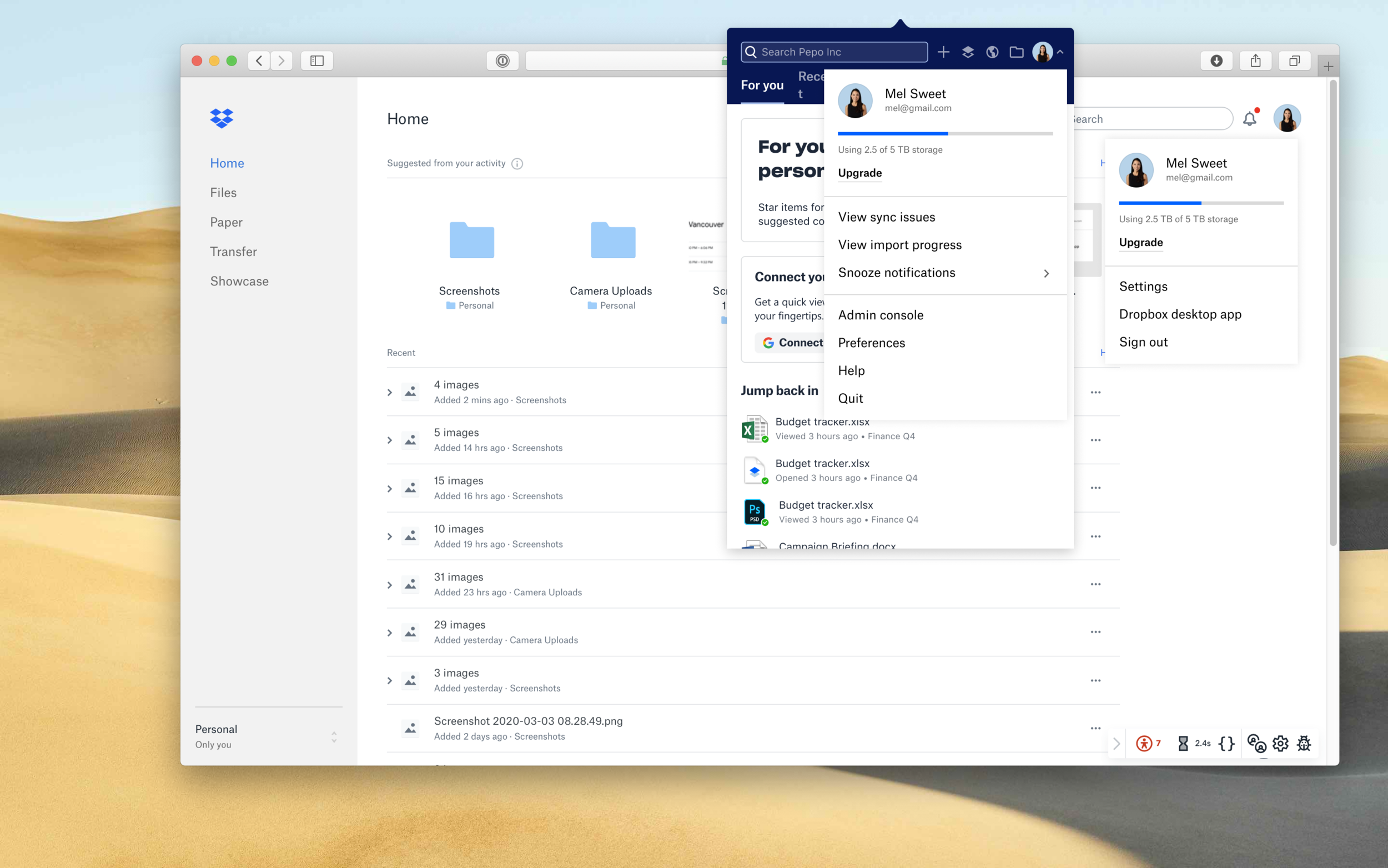
Final designs for Tray and Web
Step 1: Understanding the problem space
The profile dropdown’s look and IA was wildly different depending on which surface you were coming from; it was also not up to the latest design system guidelines and was a sore spot for an otherwise “Dropbox-y” look. These issues manifested in user confusion when switching between surfaces and Dropbox accounts. Account plan information was hidden behind several clicks, promotion of our other apps was haphazardly prioritized, and in-product upsells were promoted disproportionately on web.
Our goals were to:
Improve the overall profile UX consistent across each surface
Increase desktop app installs
Keep user engagement consistent
Reduce design and engineering overhead/maintenance complexity
Here’s a look at where we started:
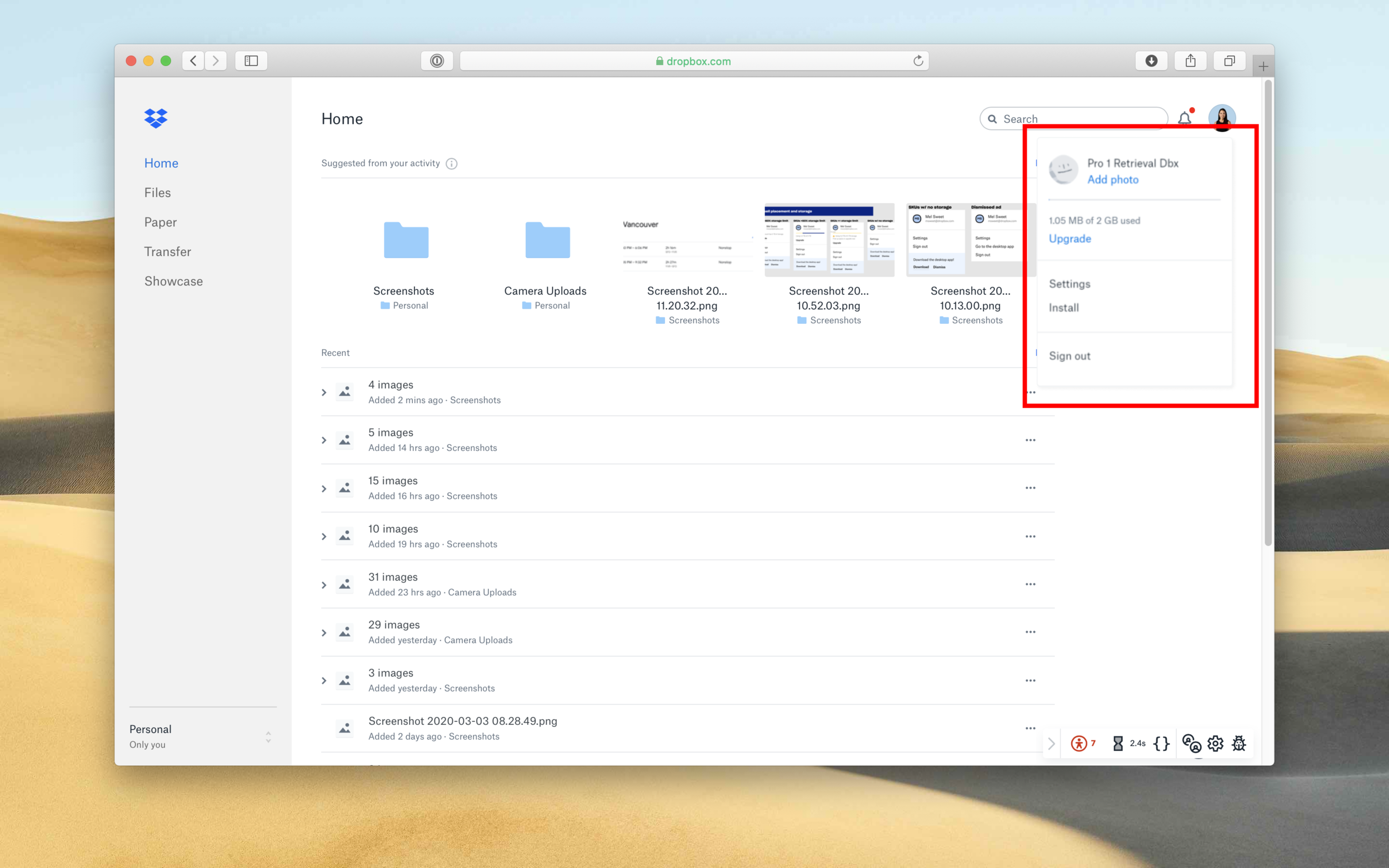
Web
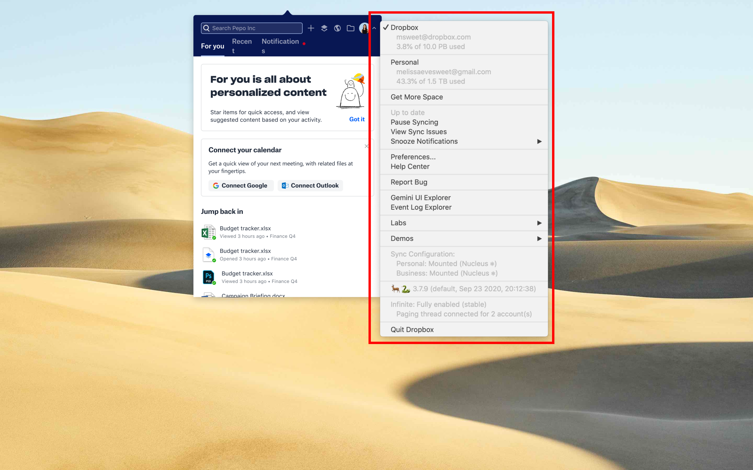
Tray
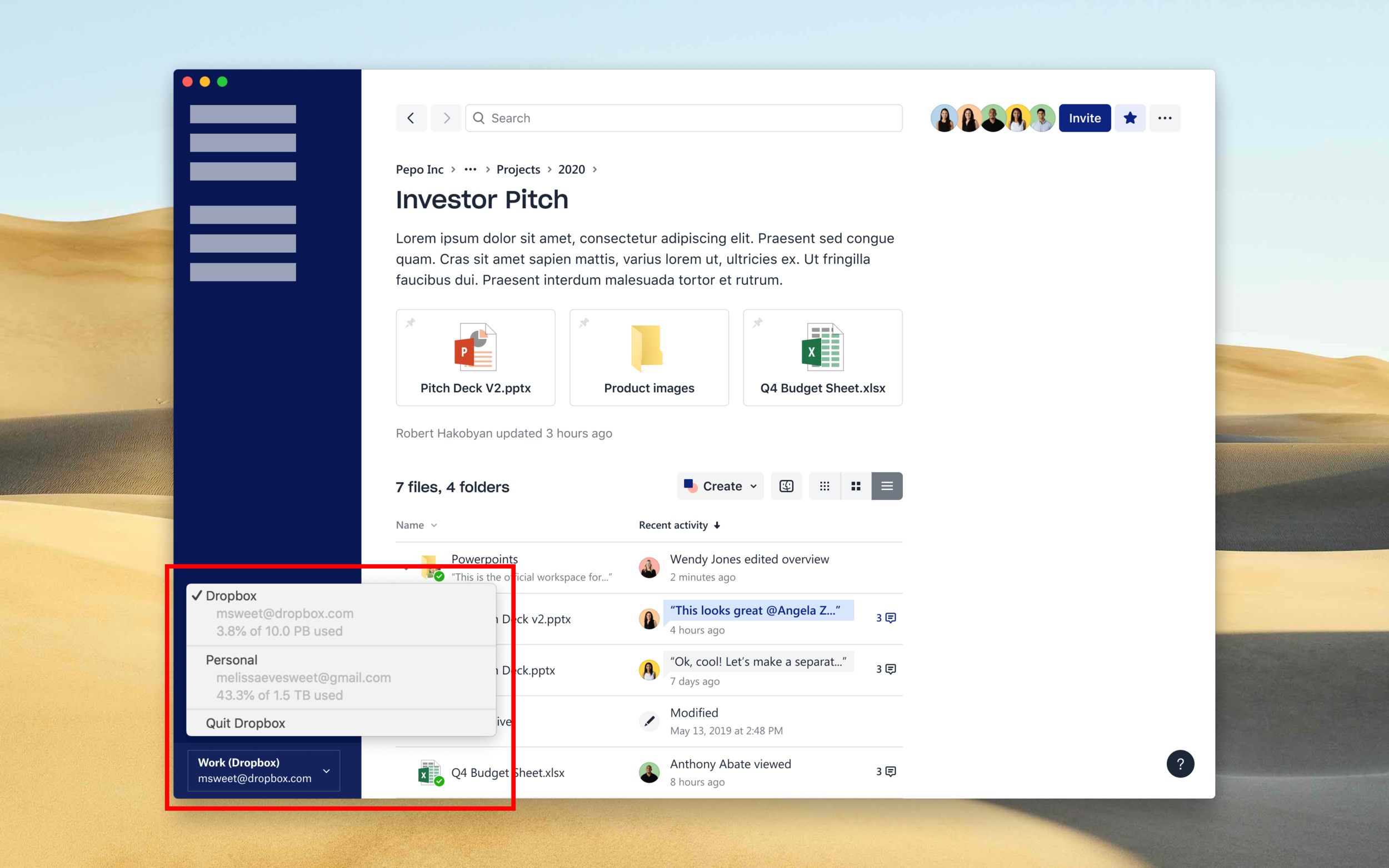
Desktop app
Step 2: Process
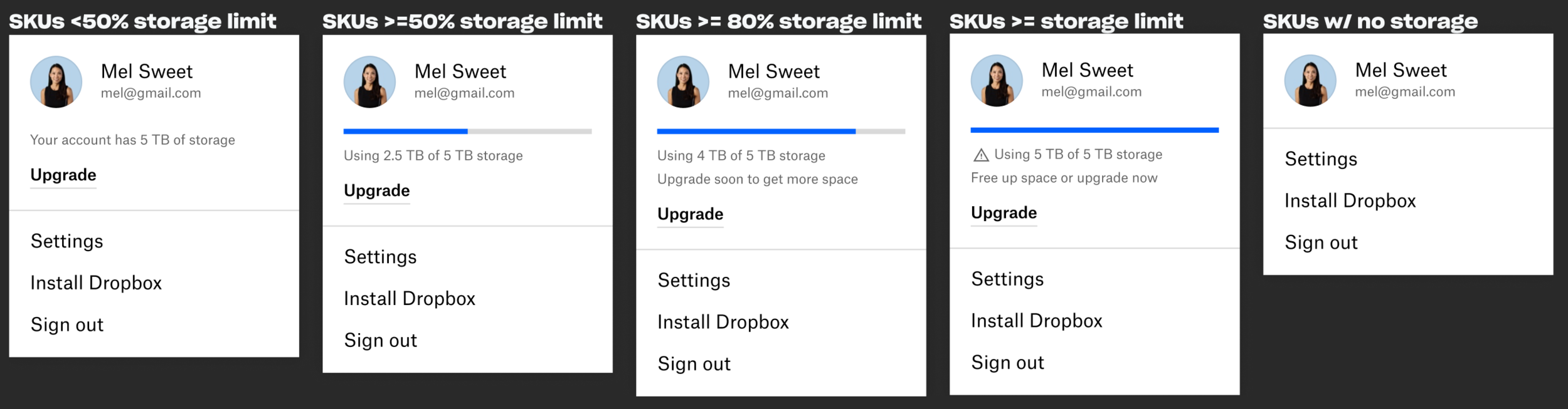
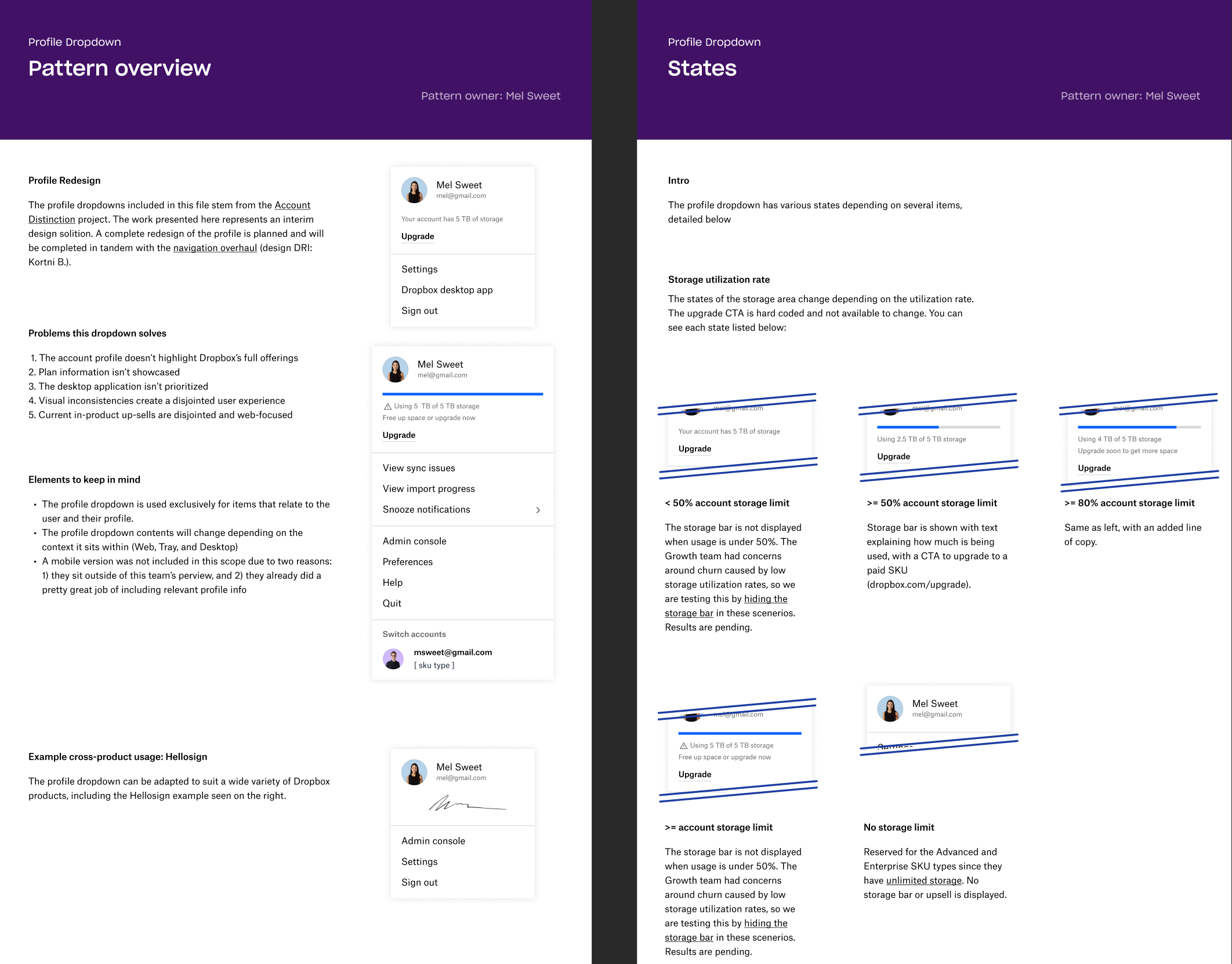
I created a consistent, reusable component that could be implemented across each of these surfaces. This was the initial step to (1) align our desktop and web surfaces, (2) enable a better account experience for users and (3) create awareness of the user’s plan (eg. storage, name, email). This work brought relevant information to the foreground instead of multiple clicks away, helping our users manage their Dropbox account.
Project outcome: I experimented with creating robust logic around displaying or hiding the user’s storage bar. This “bonus” scope ended up earning the team $4.1M annual reoccurring revenue.
Before pixels were committed to code, I conducted guided user interviews and async user testing with the new designs to ensure any lingering user confusion or issues were addressed. Final designs were delivered in two formats, specced for engineering as well as with thorough documentation for future teams to leverage for their work moving forward (portion seen below).
Final results
The new, flexible profile dropdown was created as a new design system component that was updated product-wide, reducing overall developer time and maintenance needs
Solved a top 5 user issue around surfacing consistent account storage information across each Dropbox surface.
Reduced paid account churn and was revenue positive for individual account upgrades. The new storage bar logic reduced paid account churn even further and amounted to a $4.1M annual reoccurring revenue (ARR) win
Additional clarity on the desktop app install CTA Increased the click-through rate by 17%
All illustrations created by Dropbox brand design team