Problem
Filled with feature cruft, the Tray needed some tending to increase user retention
Product
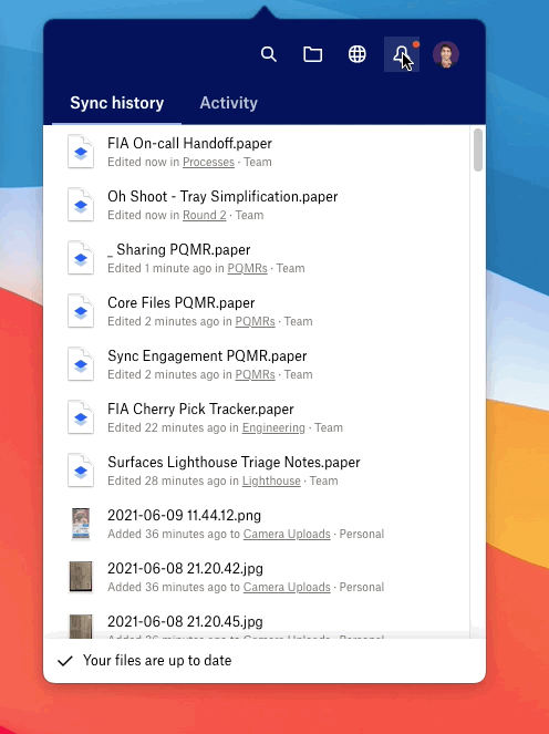
Desktop Tray
My impact
Found and removed features with the lowest usage, tested various iterations of the final product, and shipped a newer, streamlined version of the Desktop Tray
For this project I was the lead designer working to simplify one of Dropbox’s most fraught surfaces: the Tray on desktop.
Once we improved the user profile and streamlined the account connection process, I continued along the journey to deliver on Simplifying Dropbox and turned my attention to Dropbox’s “feature junk drawer”: the Tray.
The current Tray (a Dropbox surface accessible via a computer’s system menu bar) was previously designed to complement the release of our desktop app in fall 2019. The main addition to the tray was a set of smart and assistive features, driven by the desire to make intelligence the “DNA of the product”.
Now a few years post-release, overall retention was declining and the smart/assistive features had the lowest usage and retention across user segments.
New Tray design
By reducing functionality, we significantly improved retention and engagement
Step 1: Digging into the Tray’s shortcomings
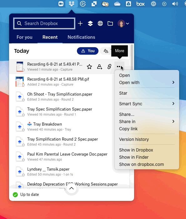
Original Tray design
Too many features with low utilization rates brings unnecessary clutter to an already small surface
Qualitatively, survey data indicates that users are coming to Core Dropbox (Files product) with File, Sync and Share use cases in mind. It quickly became clear that this surface was losing product/market fit.
Historically, Core Dropbox (the product that centers around Files, Syncing, and Sharing) has been the only vehicle for various teams to introduce new features and functionality. Dropbox was at that point moving towards a new product strategy which provided the perfect opportunity to re-evaluating how Tray could change to re-focus on core use cases.
Our hypothesis was this: if the Tray became a more focused surface and we removed low-engagement cruft, this would improve Week over Week (WOW) retention. We also set key guardrail metrics on areas such as user engagement, sharing, etc. Even if these key metrics took a minor hit, the overall simplification of this surface would be deemed a user experience success.
Step 2: Uncovering the feature cut line
It’s important that Dropbox re-assessed the Tray’s position within Dropbox’s portfolio of surfaces. This work was a first step towards the larger process of taking big swings to streamline our products, the role of the Tray, and future jobs-to-be-done here both now and into the future. Together with my Product partner, we took a look at similar competitor surfaces to understand the landscape, as well as across our own surfaces. Where there any gaps or areas that the Tray could uniquely serve?
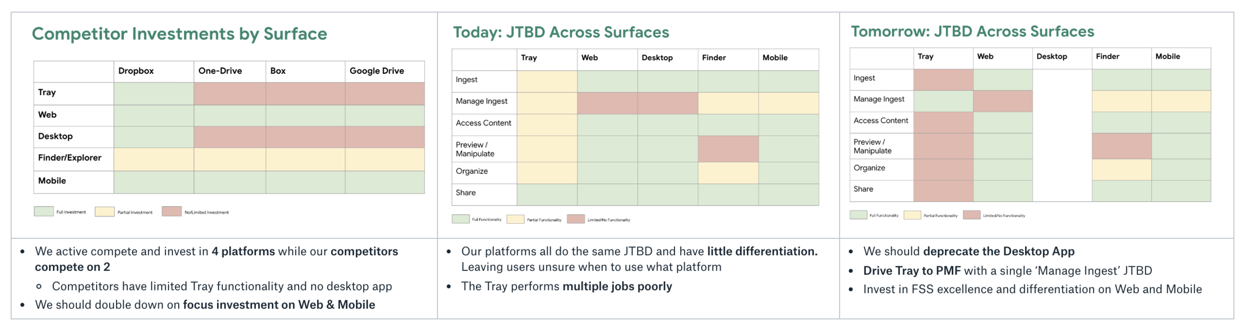
In the middle chart, we can see that the Tray does many things poorly. Instead of focusing on one or two areas to focus on the result is a hodgepodge of miscellaneous features. In the last chart, I mapped out what the future of Tray could look like if it were to instead focus on a single job: manage ingestion of content (aka become the one-stop-shop to check the status of your syncing files and folders on desktop. Tray was the only desktop surface that allowed for active management of this process.
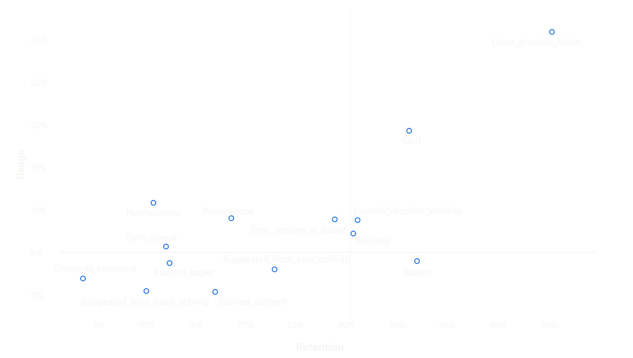
I also took a look at the usage of each Tray feature in comparison to user retention in order further test my hypothesis. Everything in the 4th quadrant below has both low usage and low retention, and was easy to justify removing.
With both of these inputs, I decided to go all-in on converting the Tray to be a Sync Station: the one-stop-shop for users to view and manage their content syncing.
Step 3: Design variants and launching experiments
This first crack at a more streamlined job-to-be-done included the design of 3 quick experiments to validate hypotheses around user behavior.
Experiment 1: removing the “For You” tab from the tab navigation
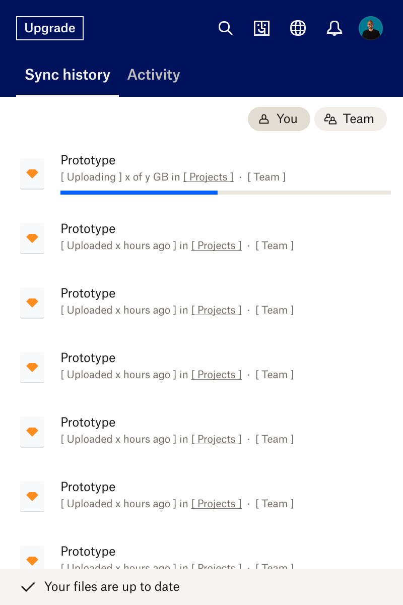
Experiment 2: combining Sync Queue with File History
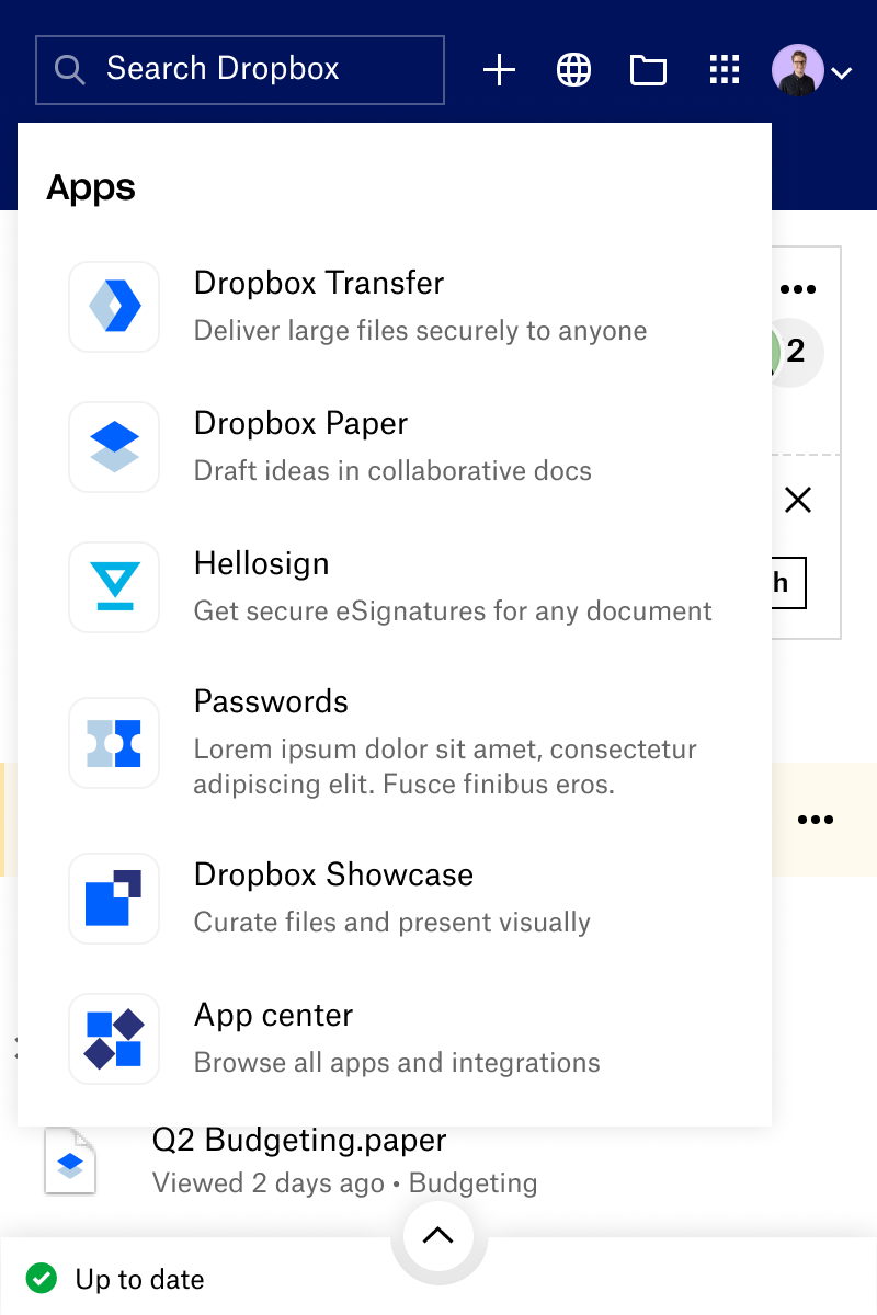
Experiment 3: adding an app product launcher “waffle”
Between the 3 experiments, all guardrail metrics remained consistent. Cross-product launches did not meaningfully increase in experiment 3, so we decided to nix the cross-product launcher and further lean into removing more features and increasing emphasis on viewing sync status.
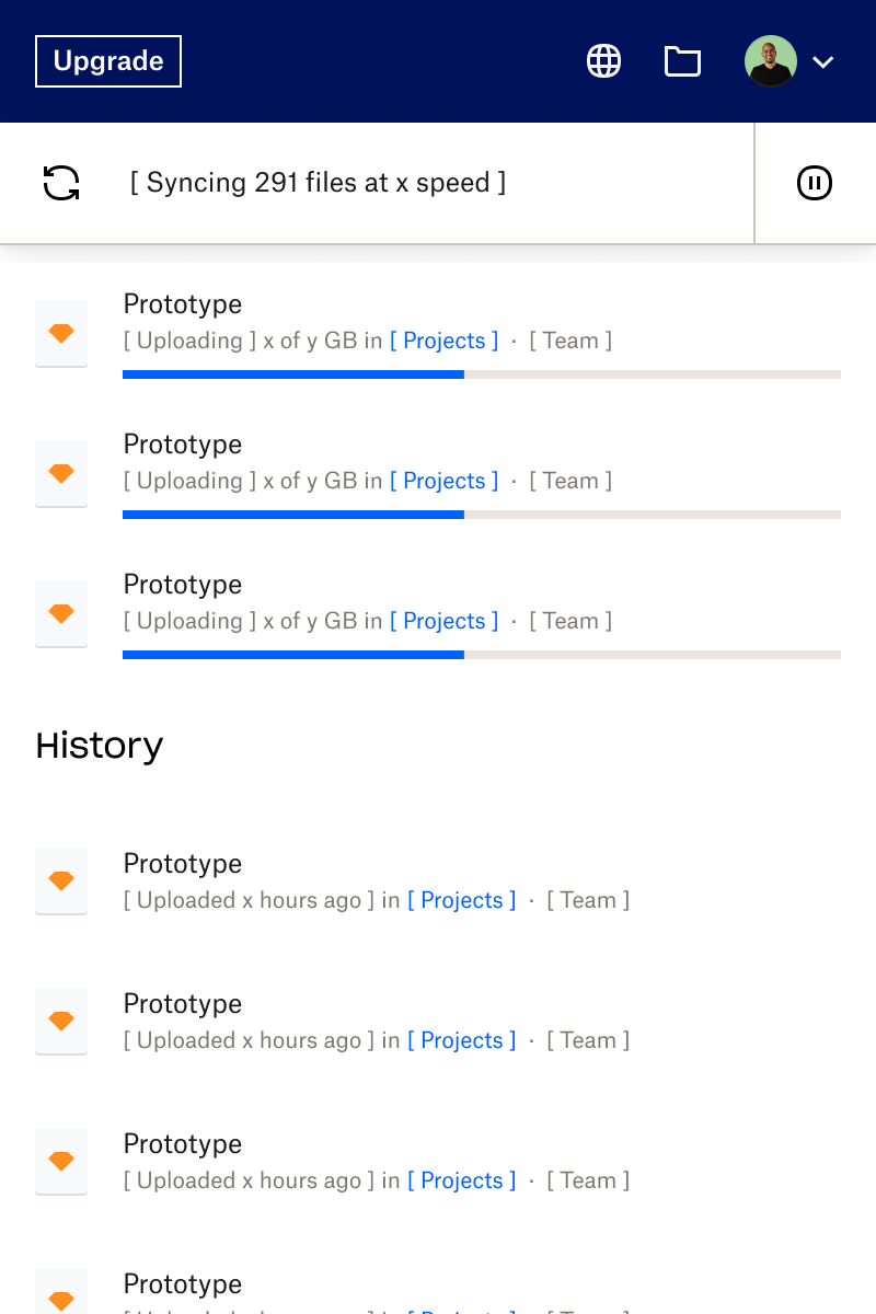
Experiment X: Sync Station is brought to the forefront and no longer hidden in a collapsible drawer.
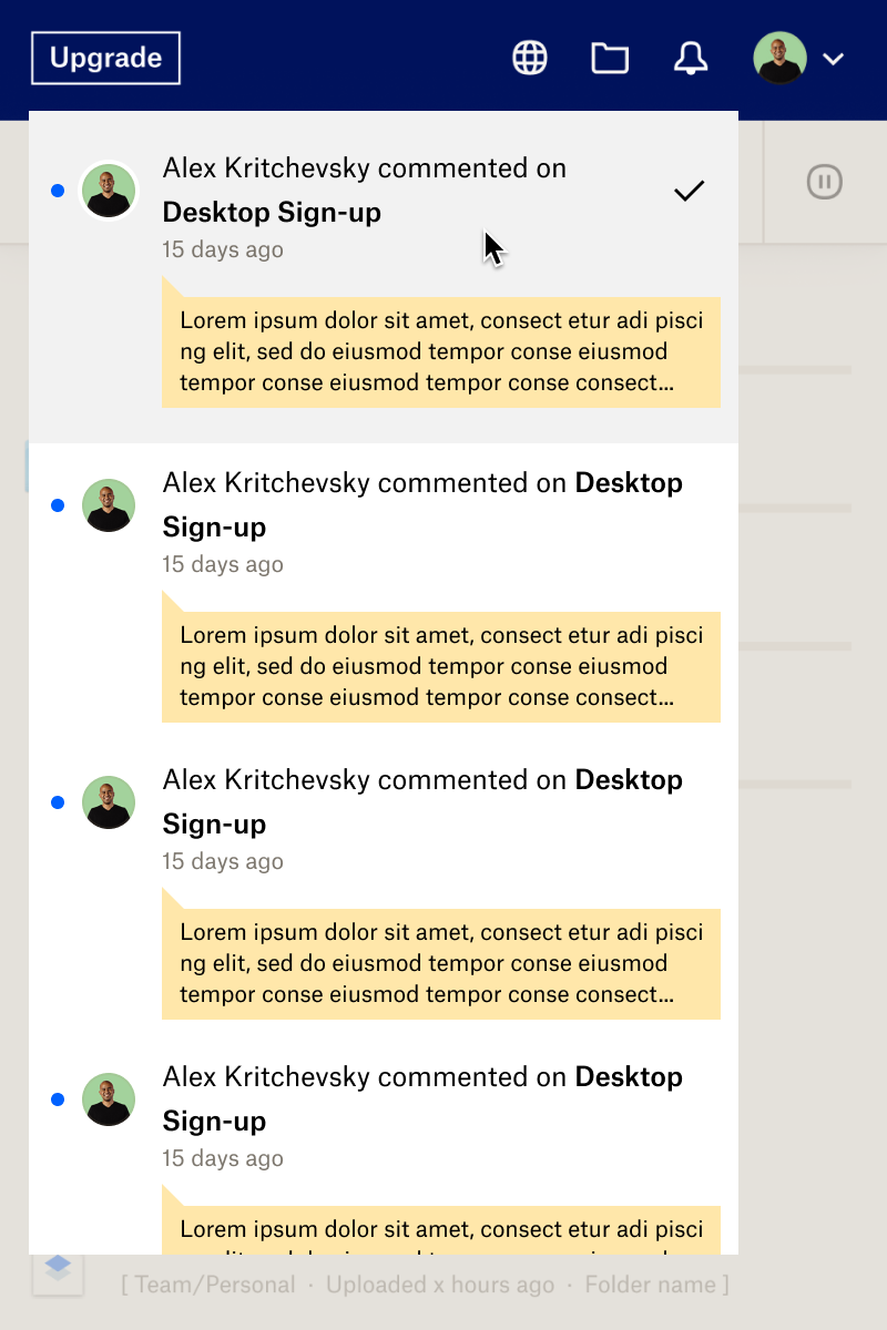
Experiment Y: Same as X, but with the addition of Notifications
Experiment Z: a more “middle ground” approach that combines elements of X+Y with functionality of the original Tray (search, content filtering, and Sync + History remaining separate)
Final Results
Experiment Z was the clear winner with week over week retention increasing slightly more than the others, and with that our focus on bringing Sync and Access use cases to the forefront paid off. We were able to simplify the Tray and make it easier for users to do the things they do most on the surface:
Faster access to what matters (e.g. Sync history tab)
Fewer overlapping features (e.g. Remove For You and renaming “Recent” to “Activity” to better reflect feature)
Less upfront clutter for infrequently used features (e.g. New sheet interactions for search and notifications)
All illustrations created by Dropbox brand design team